
The Evidence Crisis in Math Reform
The groups shaping your child's math education can't get their own numbers right, and poor kids are paying the price | Attacks on Excellence, Issue #7


Rahim Nathwani is a technologist based in San Francisco, making businesses better with tech and AI. He believes almost everyone can and should learn more math. His 9-year-old son is on track to complete Algebra 1 before 5th grade.
Part 2 has since been published on our Substack.

There is a pattern in American math education reform. An organization claims that a new teaching approach produces dramatic gains. Schools and districts adopt it. Years later, when someone checks the evidence, the gains turn out to be overstated, the methodology turns out to be flawed, and the students who were promised a better education are worse off than before.
The organizations driving these reforms say they want equity. But when their evidence doesn’t hold up, the children who suffer most are the ones these reforms were supposed to help: kids from low-income families, whose parents can’t hire tutors to fill the gaps.
This pattern has played out at least three times with research associated with YouCubed, one of the most influential math education organizations in the country.
The Chart That Doesn’t Match the Data
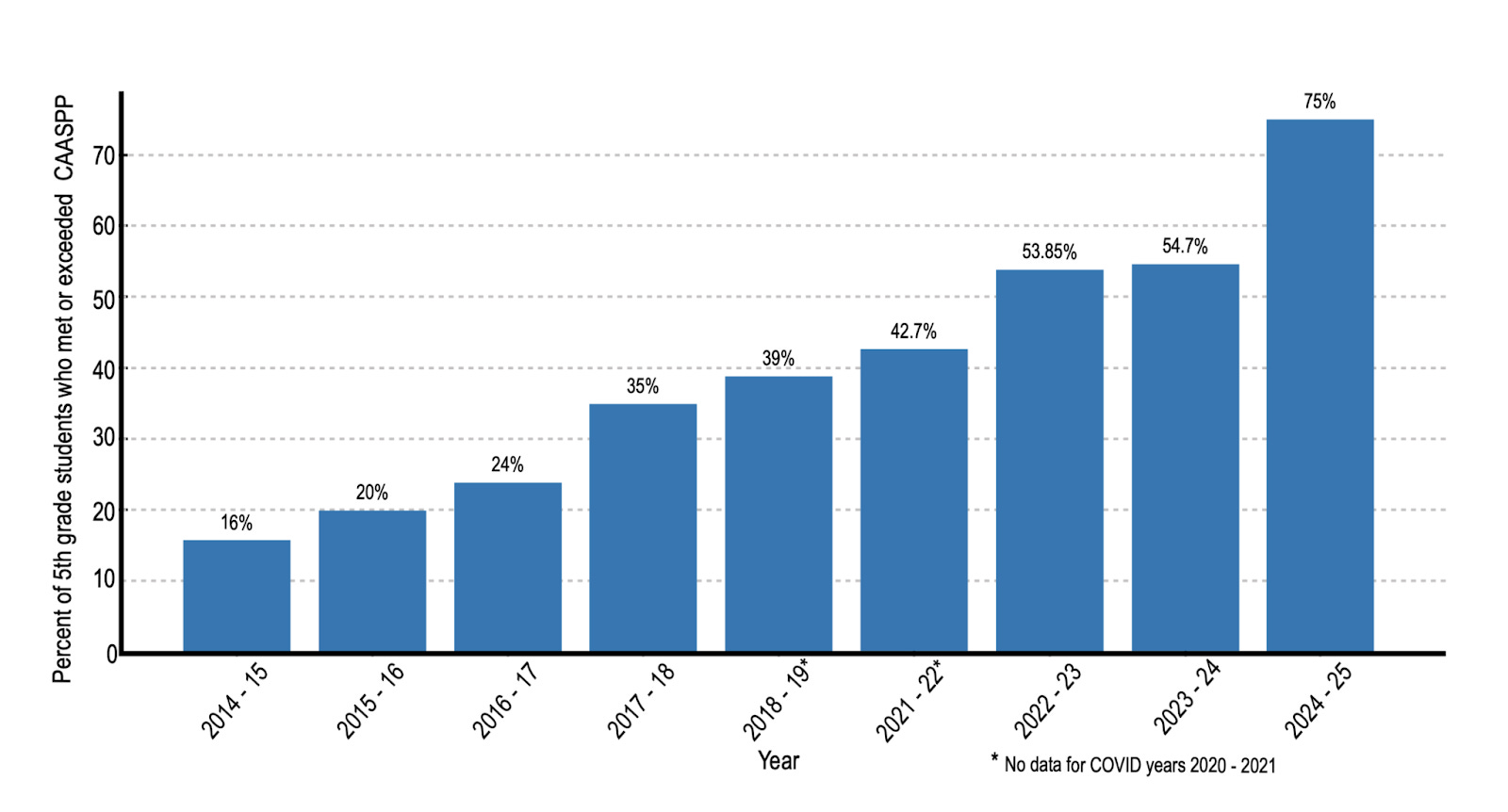
YouCubed, a Stanford-based initiative led by Professor Jo Boaler, recently published a PDF claiming dramatic math score improvements in Healdsburg Unified School District in California. The chart showed a compelling story: scores starting very low, climbing steadily, ending impressively high. It’s the kind of result that gets shared in school board meetings and cited in policy decisions.
There was one problem: The numbers don’t match the public record.
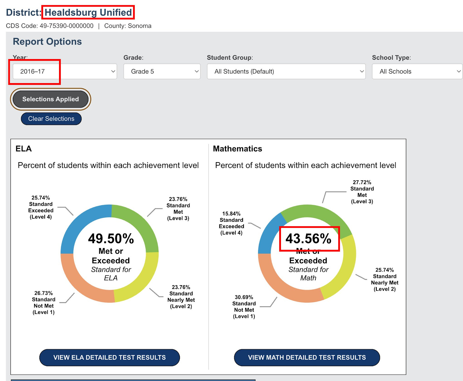
California publishes its student test data openly. Anyone can look it up. For the most recent year, YouCubed’s chart and the state data roughly agree: about 75% of 5th graders at Healdsburg meet grade-level standards. But for the baseline year (the “before” picture that makes the improvement look dramatic), YouCubed’s chart shows approximately 24%. The state’s official data for the same district, year, and grade band shows approximately 44%.
Here’s the chart from the YouCubed PDF:
And here’s a recreation of the chart based on official government numbers:
That’s not a rounding difference. That’s a gap of 20 percentage points, and it runs in exactly the direction that makes the improvement story look better.
When you replace YouCubed’s baseline with the actual public data, the narrative changes completely. Scores were roughly flat for several years, then showed a recent uptick. That might be a legitimate result. But it is not the dramatic turnaround that YouCubed presented to educators and policymakers, and which Jo Boaler shared on X.
Maybe There’s an Innocent Explanation?
In education research circles, it’s common to see researchers exclude certain subgroups from their data. The most frequent justification is something like: “We excluded chronically absent students because they didn’t receive the full intervention.”
That’s a methodologically reasonable thing to do, as long as you say you’re doing it and explain why.
The YouCubed document makes no mention of any data exclusion. But let’s ask: could data exclusion explain the discrepancy?
Here’s the problem. If you exclude chronically absent students from a proficiency calculation, you would generally expect the remaining percentage to go up, not down. Students who miss a lot of school typically perform worse on tests. Take them out of the calculation, and the percentage of students who meet standards would likely increase, not decrease.
But YouCubed’s 2016–2017 figure (24%) is far below the state’s figure (44%). That means their exclusion would have had to somehow remove the higher-performing students from the calculation. That is the opposite of what “excluding chronically absent students” would do.
We cannot think of a legitimate methodological reason why a district’s proficiency rate would be nearly cut in half by a data exclusion. If there is one, Youcubed’s report should explain it. It doesn’t.
A Quick Explainer: Why Cohort Comparisons Matter
Even setting aside the data discrepancy, there is a deeper methodological problem with the chart — one that matters even if every number in it were correct.
The chart compares “5th graders in 2017” to “5th graders in 2023.” These are entirely different groups of children. The kids who were in 5th grade in 2017 are in their early 20s now. They are not the same kids who were tested in 2023.
Imagine you run a tutoring program. In Year 1, you tutor a class of students who happen to come from lower-income families and score an average of 60 on a test. In Year 5, a different group of students — from more affluent families, in a district that has added new staff — scores an average of 80. Can you claim your tutoring program caused the improvement? Of course not.
The right way to evaluate whether an educational intervention works is to track the same group of students over time and see how they progress. This is called a “cohort study.” It’s standard in medical research (think clinical trials), and it’s the gold standard in education research too.
We went ahead and pulled the cohort data from California’s public records. We tracked each group of students as they moved through the grades. What did that analysis show? Here it is:
It did not show consistent improvement across cohorts. The picture was much more mixed than the YouCubed chart suggests.
In fact, if we look at the most recent cohorts (the kids who entered 3rd grade in 2018 or later), we see that almost all cohorts (grades) have a downward trend: the chance that any given kid meets state standards in math goes down as they spend more years at Healdsburg school district.
This matters because the entire point of the YouCubed document is presumably to persuade: to show that the YouCubed approach works, and that other districts should adopt it. If the underlying analysis is methodologically flawed (and if the baseline data appears to be inaccurate) then that persuasion is built on sand.
The Study That Couldn’t Be Verified
This would be easier to set aside if it were an isolated mistake. It is not.
YouCubed’s influence traces back to Professor Boaler’s most celebrated research: the “Railside” study, published in 2008, which claimed that a reform-math approach at a California high school produced dramatic gains, especially for minority students. That study became enormously influential. It shaped curricula, frameworks, and professional development programs across the country.
In 2012, two Stanford mathematics professors and several colleagues published an extended critique. They raised serious concerns: the school had been misrepresented, the data couldn’t be independently verified, and the conclusions overstated what the evidence showed. Rather than release the underlying data for independent review, Professor Boaler characterized the critique as harassment.
The data was never made fully available. The study remains widely cited.
The Framework Built on Selective Evidence
In 2023, California adopted a new Mathematics Framework that drew heavily on Boaler’s ideas and YouCubed’s recommendations. The framework discouraged ability grouping, de-emphasized procedural fluency, and delayed access to advanced math courses — all in the name of equity.
More than 1,000 scientists and mathematicians signed an open letter objecting. Their concerns: the framework cited research selectively, dismissed evidence from high-performing countries, and would likely harm the students it claimed to help — particularly those aiming for STEM careers.
A Stanford mathematician who reviewed the framework’s citations in detail documented numerous cases where cited studies either didn’t support the claims being made or actively contradicted them. Misrepresented citations, like misrepresented data, are hard to attribute to innocent error when they consistently run in the same direction.
The Pattern
Three cases. In each one, research associated with the same organization claimed dramatic results. In each one, outside review found serious problems with the evidence. And in each one, the discrepancies ran in the same direction: making the reform approach look more effective than the data actually showed.
A single error is understandable. Research is hard, and mistakes happen. But when the mistakes consistently flatter the same conclusion, the most straightforward explanation is not bad luck.
This matters because education policy is downstream of evidence. When a district eliminates ability grouping, it cites research. When a state delays algebra, it cites research. When a school board adopts a new curriculum, it cites research. If that research is unreliable, every decision built on it is compromised.
Who Pays the Price
When a math reform fails, the cost is not distributed equally.
Families with resources respond to a weak math program the same way they respond to every institutional failure: they route around it. They hire a tutor. They enroll in a supplemental program. They move to a different district. And this last dynamic is perhaps the most destructive: declining public school enrollment means system-wide strain, fewer resources for schools and teachers, and eventual school closures. This phenomenon is showing up across the country, and it seems to be driven by wealthier, white, and asian families, especially those in deep-blue districts experiencing acute education dysfunction. Seattle has seen thousands of families leave public schools, and private schools in San Francisco are brimming with new applicants.
Families earning $200,000 a year have options and are evidently ready and willing to use them.
A family earning $40,000 does not. When school math instruction is the only math instruction a child receives, the quality of that instruction is the ceiling on that child’s opportunity. A low-income child whose school adopted a curriculum based on overstated evidence doesn’t get a do-over.
The cruelest irony is that these reforms are justified in the language of equity. The children they claim to champion are the ones with the fewest alternatives when the reforms don’t work.
What Should Be Different
None of this means that math education shouldn’t evolve, or that traditional approaches are beyond criticism. But it does mean that the organizations driving reform need to meet a basic evidentiary standard: the same standard we’d expect of a pharmaceutical company claiming its drug works.
That standard is straightforward. When you publish results, the underlying data should be available for independent review. When your chart shows a number, it should match the public record. When you cite a study, the study should actually support the claim you’re making. And when someone finds an error, the response should be a correction, not an accusation.
These are not hostile demands. They are the minimum that parents, teachers, and policymakers deserve before reshaping how children learn mathematics.
One bad chart would be forgivable. But what we’ve described here is a pattern: influential organizations are shaping how millions of children learn math based on research that hasn’t survived basic scrutiny, and the kids who pay the price are the same ones the reforms were supposed to help.
Your child’s math education deserves evidence that holds up when someone checks.
Related Articles


 | A guest post by
|
Old fart here. Been there, done that. There are problems even in very good school disctricts. I had to raise hell to have my kids at the appropriate math level in school. As it was, I supplemented their math education on my own (I am a Physcist with a Ph.D. in Engineering so I could, and my wife has a MS in teaching English as a Foreign Language so she could hancle the language arts when necessary).
I did not take no for an answer. I got my 6th grade daughter into the most advanced math class the Middle school had. In 7th grade I had to take her to the high school for her math class (there were a number of other parents doing the same with their kids, mostly 8th graders). She was also ~ 50% an online student in 7th grade as many of the classes were far too slow and boring. She skipped 8th grade and I had her do Geometry by correspondence over the summer - she got placement, not credit. I had her do pre-Calculus the next summer and she did college calculus in 10th grade before dropping out to do early admission at the state university, where she studied engineering. Her brother wasn't quite as advanced and didn't skip a grade, so he did Calculus when he started Running Start in what would have been 11th grade. I would guess that over 2/3's of the students in their Honors / IB classes in high school were the children of highly educated East and South Asian parents.
I am convinced many educational researchers willfully ignore the fact that when they degrade the educational experience for students the more capable parents will either supplement or leave - and the results in student learning among the children of the more capable parents do not reflect the degraded educational experience, but the students of the poorer and/or less capable parents definitely have their education degraded.
To the extent that the schools were doing a good job - I did not intervene. When they did not do an appropriate job - I did.
Very well organized report. Thanks for your fine work.